AI + Data Experiments
Research, Writing, & Strategy
Artificial intelligence is transforming how we create, interact, and even think. While concerns about privacy, societal, and ethical issues are valid, I'm still an optimist. With thoughtful application, I believe there is a huge potential to harness AI for good, turning sophisticated data into simple solutions. The projects showcased here, born out of my graduate studies in data science, aren't just about algorithms and code — they're about understanding people, telling stories, and crafting meaningful experiences. From tackling practical challenges like simplifying nutrition tracking with AI, to exploring creativity through generative art and examining how data can improve content and design choices, these experiments exemplify my multidisciplinary approach and passion for combining cutting-edge technology with educational yet engaging storytelling.
Proof of Concept Nutrition Calculator
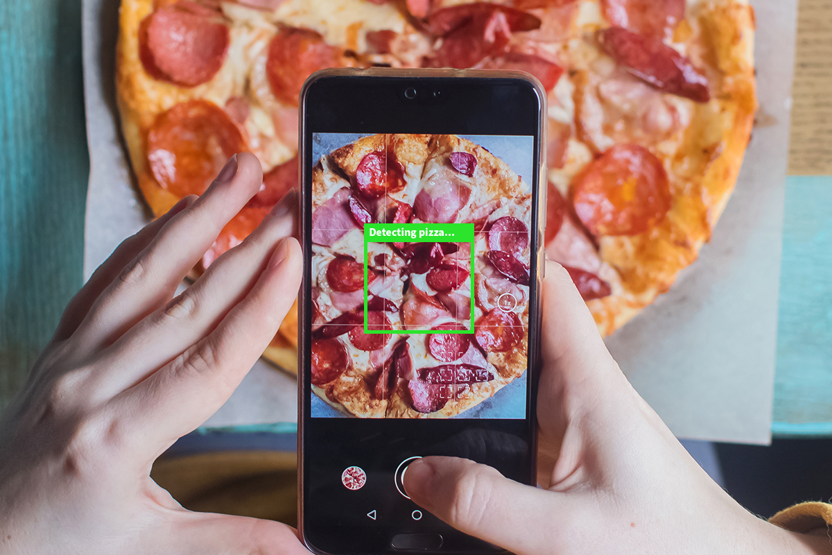
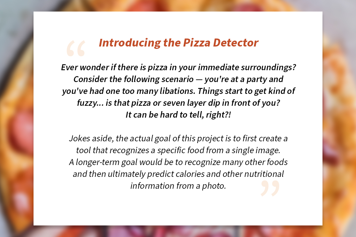
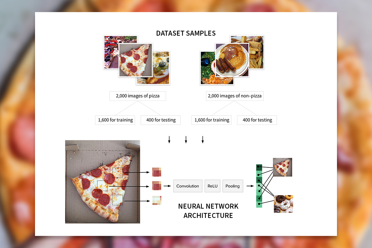
As someone passionate about health and wellness, I envisioned an app back in 2016 that simplifies tracking your daily food intake. The core idea is simple: snap a photo of your meal and instantly get all the nutritional info. However, achieving this requires the crucial and rather complex task of first recognizing different kinds of foods. That's where my "Pizza Detector" app comes in, a proof of concept that demonstrates the potential of AI to recognize at least one kind of food (pizza, obviously). I brainstormed the concept, ideated use cases, and built a machine learning model for food image recognition. But the real magic lies in the project's engaging narrative. I crafted witty website copy that explains the complex technical aspects in a relatable way, showcasing the app's value proposition — empowering dietary choices in a fun and informative way. My work has even sparked interest from other health and wellness (as well as pizza) enthusiasts in the tech space who see the potential for further development.
Paint By Generative Adversarial Network
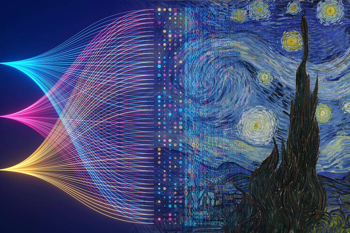
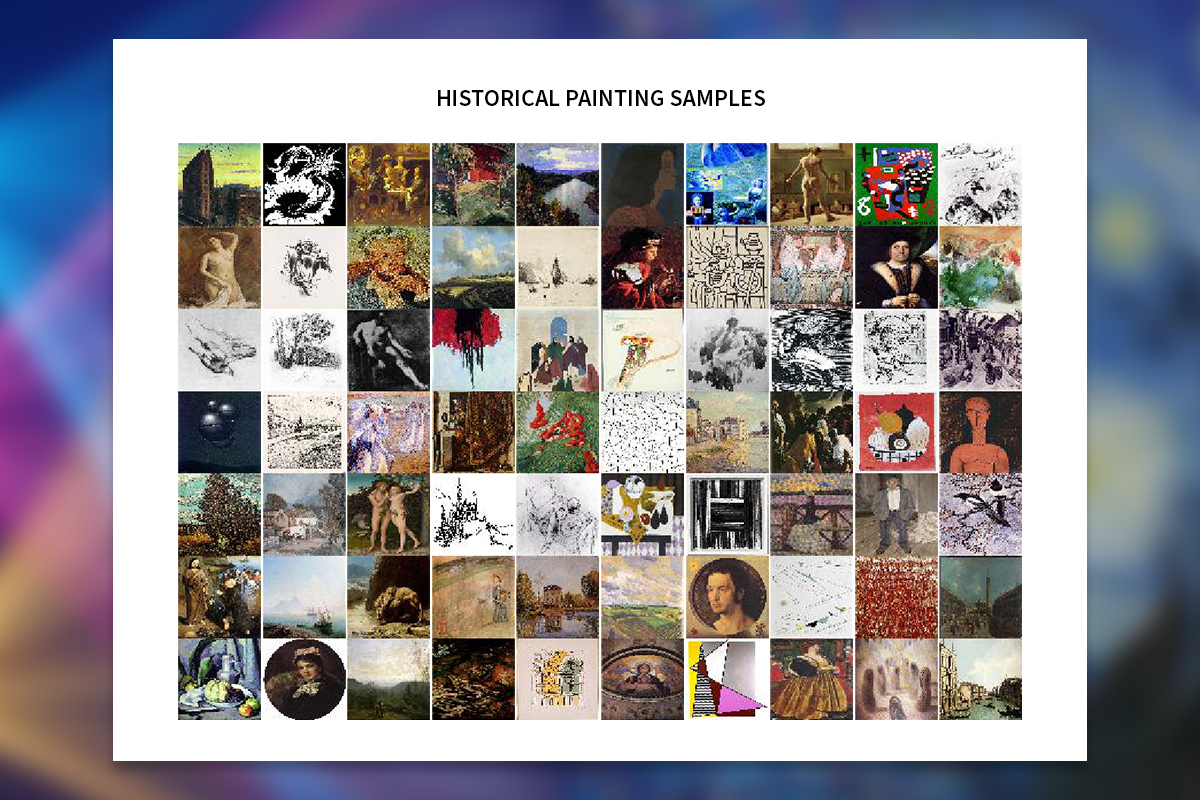
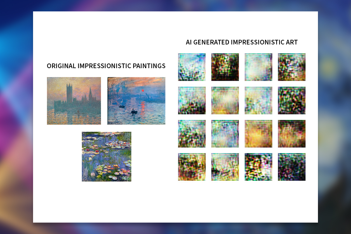
Even before the recent generative AI boom, I've been dabbling in the fascinating world of machine-generated art. Curious about the creative potential of AI, I built a Generative Adversarial Network (GAN), aiming to see if it could produce novel artwork reminiscent of masters like Van Gogh and Monet. Unlike text-to-image models that rely on specific prompts, a GAN is more open-ended, generating unique variations without user input. I trained my GAN on a diverse collection of historical paintings, focusing on capturing the essence of various artistic styles and movements. This specialized AI architecture makes use of two neural networks in a creative duel: a generator model, striving to produce new artworks, and the discriminator, learning to distinguish these increasingly convincing AI creations from the originals. This ongoing competition pushes the generator to craft increasingly sophisticated artwork. While the model's full potential was limited by technical constraints, the generated images hinted at the possibilities of AI-powered artistic expression. Learn more about the project's process and outcomes by checking out the technical paper I wrote and the presentation that visually showcases the story behind the project.
App User Interface Analysis
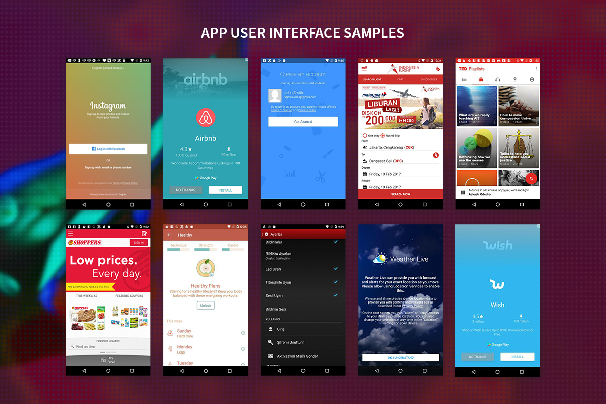
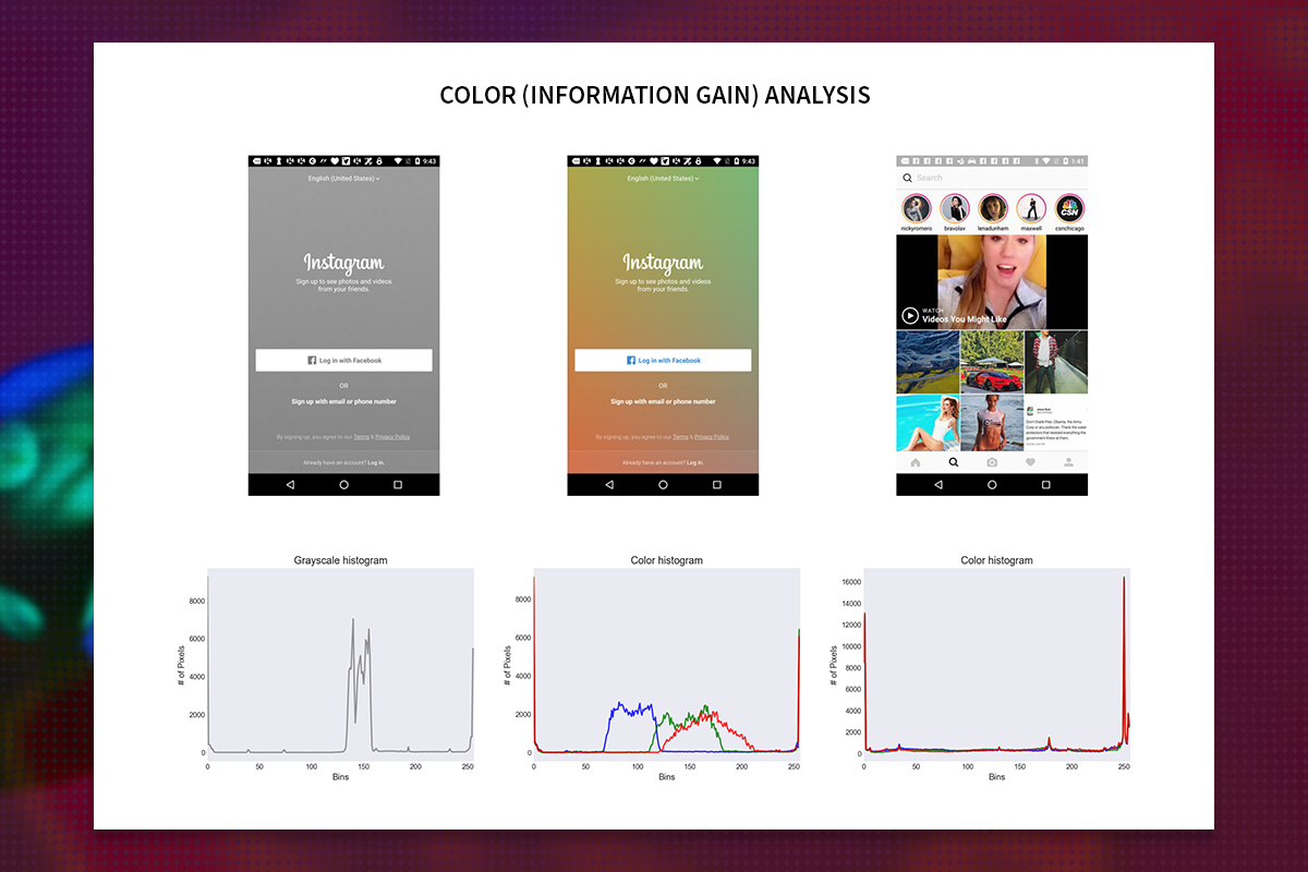
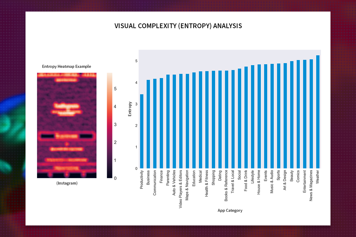
Is it possible to quantify the somewhat subjective notion of "usability" in user interface design? Intrigued by this question, I turned to Information Theory, a mathematical framework that provides a way to understand how information is represented, measured, and transmitted. By analyzing thousands of app screenshots, I measured their visual complexity (entropy) and the added value of color (information gain), aiming to uncover hidden patterns and insights that could guide the creation of more intuitive and engaging user interfaces. My analysis revealed that different app categories exhibit distinct visual styles, highlighting the importance of tailoring information density to user needs. Additionally, I found that color significantly enhances the richness of UIs, emphasizing its role in user experience and communication. While a subtle correlation between visual complexity and user ratings hinted at the delicate balance content must strike between aesthetics and usability, this project serves as a prime example of leveraging data to inform design decisions. You can delve deeper into the analysis and specific findings on the project's GitHub repository.

