The Science of Sleep
Design, Research, Science Communication, & Writing
The Science of Sleep is an infographic created to educate and engage a general audience by making complex sleep science accessible and visually appealing. I translated thorough research into clear, relatable content, transforming intricate scientific data into a narrative that is easy to understand. With accessibility as a priority, I simplified complex ideas and enhanced them with custom-designed visuals, ensuring broad comprehension. Each element, from the whimsical title to the cloud-like sleep-themed illustrations, was designed to complement the content, creating a reading experience that is as informative as it is visually engaging. This project demonstrates my ability to combine creativity, research, and analytical thinking to produce content that resonates with and enriches the scientific understanding of the public at large.
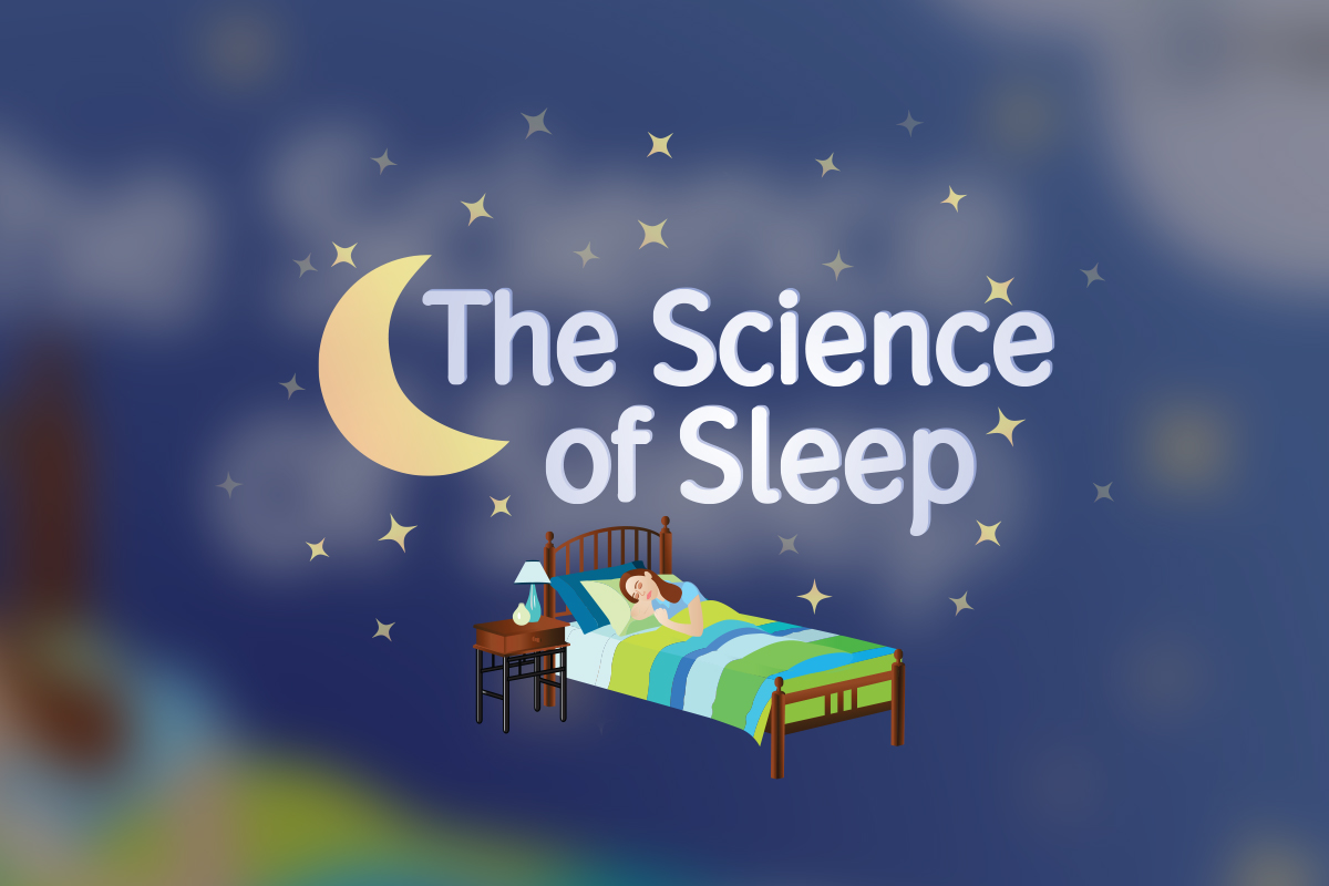
Title Illustration
The title graphic was designed to evoke the magical and mysterious nature of sleep, setting a whimsical tone for the entire infographic. I chose a soft, rounded font and delicate blue tones to create a calming, dreamlike atmosphere, enhancing visual appeal and readability — a crucial aspect of effective infographic design. All illustrations were custom-drawn with no stock images or AI-generated content, ensuring a one-of-a-kind visual identity. The surreal elements, like the moon and stars, juxtaposed with realistic depictions of the bed and nightstand, mirror how dreams blur the line between reality and fantasy. This approach not only supports the narrative but also draws the audience into the content, making the science of sleep both appealing and accessible.
Writing & Graphics
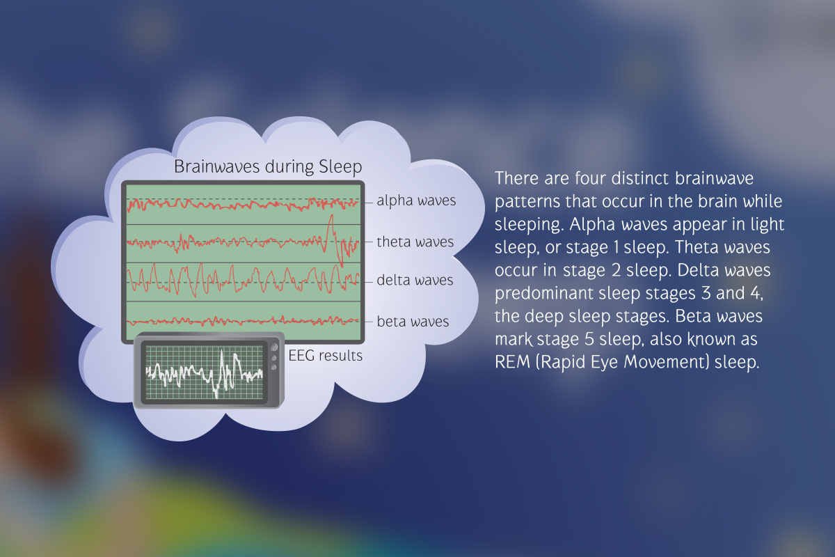
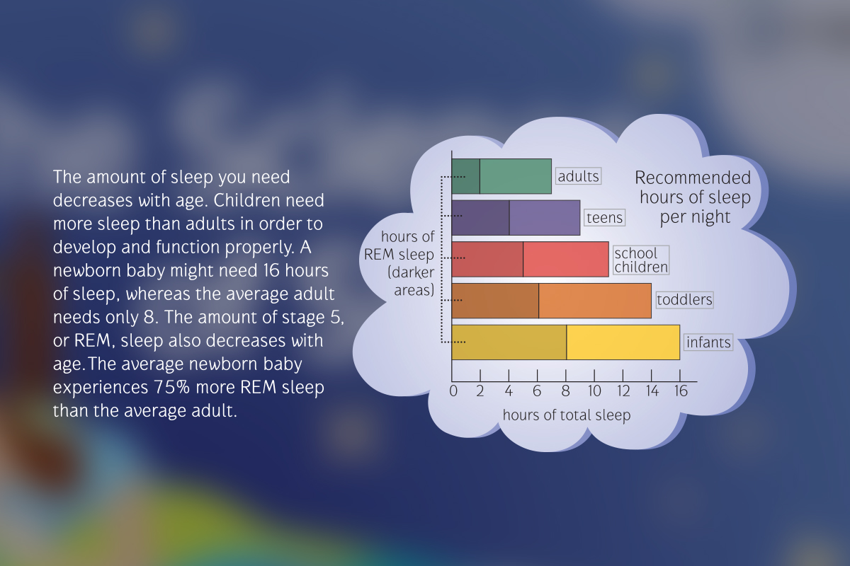
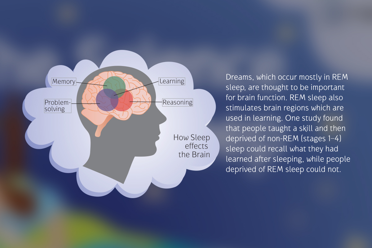
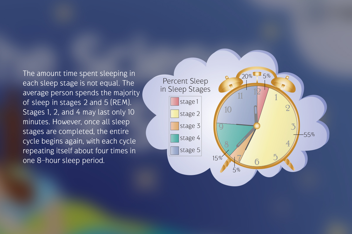
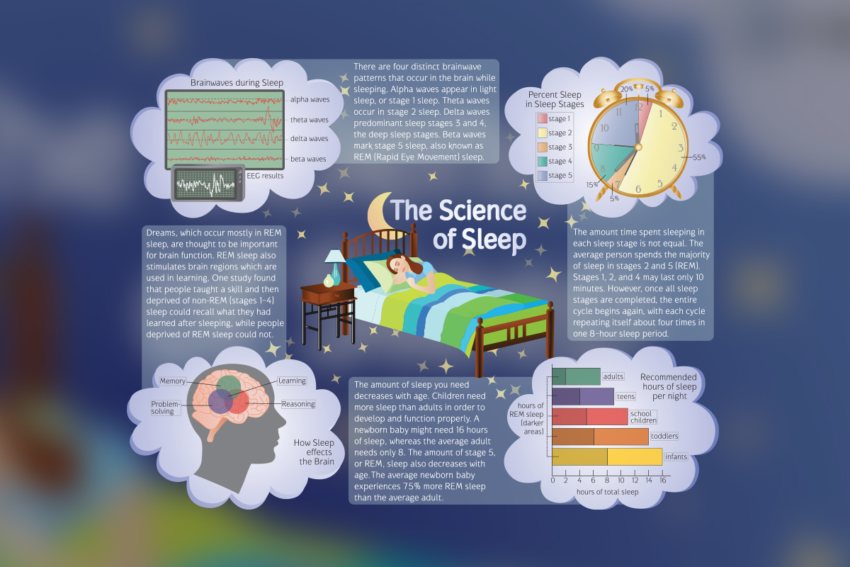
The infographic's content is carefully crafted to convey key concepts about brain activity, sleep requirements, sleep stages, and brain function during sleep. Each section is supported by relevant visuals, such as brainwave patterns, graphs illustrating recommended sleep hours, and a neuroanatomical illustration of the brain. Visual metaphors were thoughtfully integrated, such as an alarm clock reimagined as a pie chart to depict the percentages of time spent in different sleep stages. The text is written to be concise and informative, balancing scientific accuracy with accessibility, making it suitable for a general audience. Overall, this project showcases my ability to merge informative copywriting with visually appealing design, resulting in a comprehensive educational tool that is both visually engaging and easy to understand.
Full Infographic
The infographic in its entirety strategically combines expressive content design with meticulous copywriting, transforming complex sleep science into a clear and engaging narrative. By prioritizing clarity and visual hierarchy, the design guides the viewer through the content in an intuitive, yet compelling manner, with key messages standing out and supporting details enhancing understanding without overwhelming the reader. The flow of information is logically structured, thanks to a thoughtful content strategy that ensures each element contributes to a seamless journey through intricate scientific concepts, making them accessible and memorable. Custom-designed illustrations and strategic use of color create a cohesive, polished look that not only captures attention but also reinforces the narrative of the content. The infographic also reflects the duality of sleep — while the nature of sleep is well-studied and understood in many ways, it remains full of unanswered questions and mysteries. It’s a subtle reminder that even the most rigorously studied subjects hold space for curiosity and discovery.

